Rebuilding a cybersecurity brand's front door around trust, clarity, and conversion.
The Business Challenge
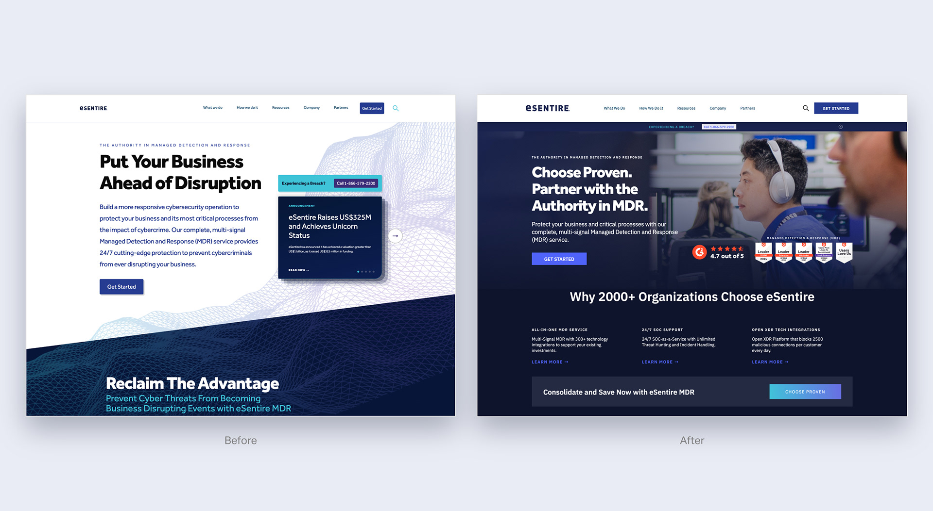
eSentire’s legacy web architecture was actively bottlenecking the conversion funnel. The site relied on a dense, mesh-heavy design typical of the cybersecurity sector, resulting in cognitive overload for users. The information architecture forced products into silos, and an oversized intake form was stalling inbound leads. The executive mandate was clear: rebuild the brand's primary digital asset into a high-trust, conversion-optimized ecosystem that could scale alongside aggressive lead-generation targets.
eSentire’s legacy web architecture was actively bottlenecking the conversion funnel. The site relied on a dense, mesh-heavy design typical of the cybersecurity sector, resulting in cognitive overload for users. The information architecture forced products into silos, and an oversized intake form was stalling inbound leads. The executive mandate was clear: rebuild the brand's primary digital asset into a high-trust, conversion-optimized ecosystem that could scale alongside aggressive lead-generation targets.
The Operational Strategy
Faced with a strict four-month launch window, I bypassed a prolonged discovery phase in favor of high-velocity, data-driven design, utilizing existing behavioural analytics to pinpoint exact moments of user drop-off.
Faced with a strict four-month launch window, I bypassed a prolonged discovery phase in favor of high-velocity, data-driven design, utilizing existing behavioural analytics to pinpoint exact moments of user drop-off.
Bridging the gap between creative execution and bottom-line marketing objectives required a rigorous approach to information architecture. Ensuring every structural decision prioritized lead generation and user flow directly leveraged a formal marketing and business foundation. To accelerate the timeline and manage the massive volume of page migrations, I integrated a multi-model workspace pipeline into the workflow, utilizing advanced prompt engineering to systematically audit legacy content and stress-test the new messaging hierarchy.
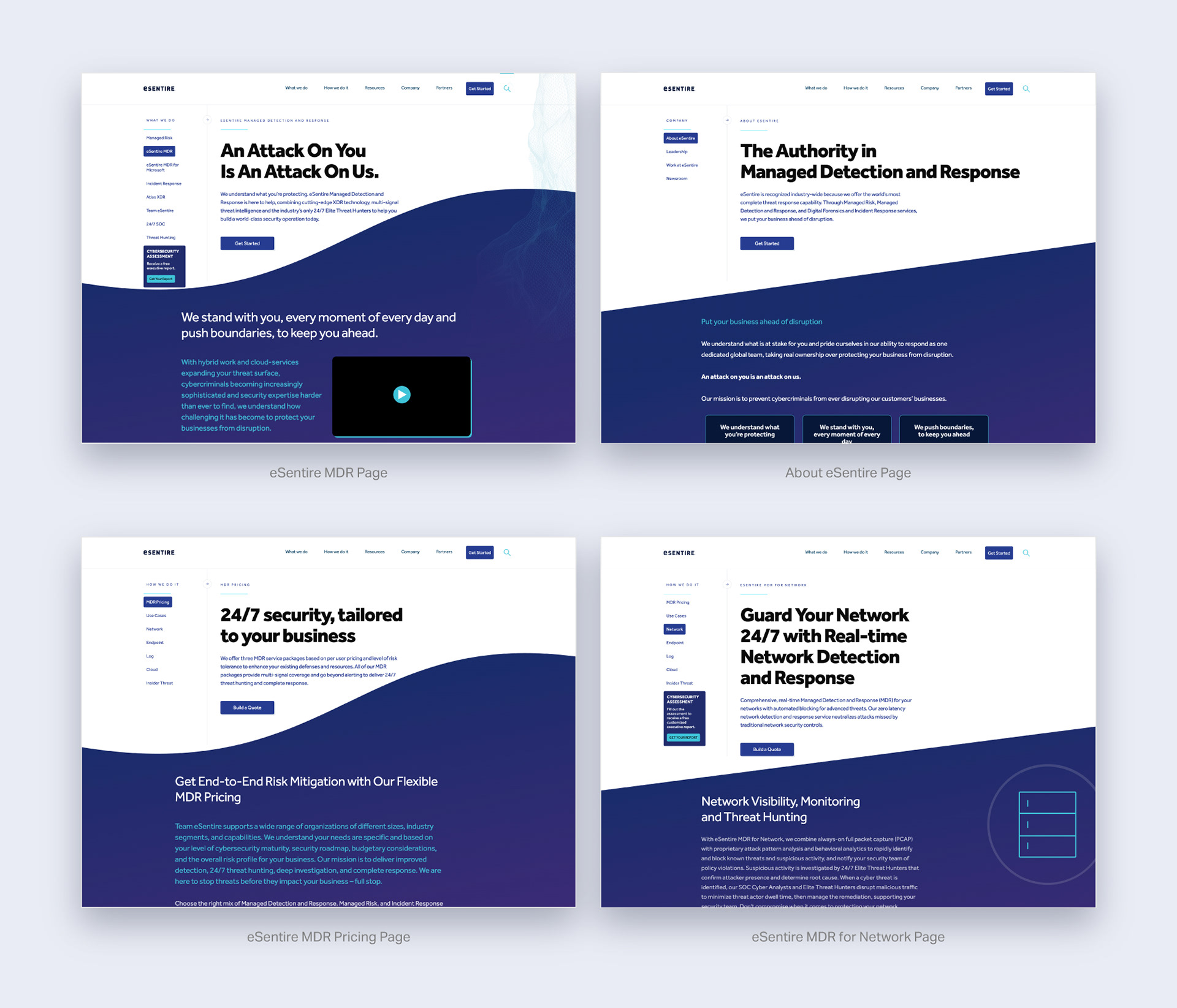
Rather than treating this as a temporary visual refresh, I engineered a highly scalable brand identity system. I delivered a comprehensive, flexible design kit within Figma, utilizing strict auto-layouts and modular components. This structural framework allowed us to completely rework the navigation—expanding to support 11 distinct industries and 12 use cases—without breaking visual cohesion or delaying developer handoff.
My Role
Design Lead (sole designer across every page)
Stakeholders
CMO & VP of Brand Marketing (sponsors); Director of Creative Services; Senior Director of Growth Marketing
Timeline
4 months for the 2023 redesign (April to July 2023); ongoing optimization through a 2025 Assured Intelligence refresh.
Design Lead (sole designer across every page)
Stakeholders
CMO & VP of Brand Marketing (sponsors); Director of Creative Services; Senior Director of Growth Marketing
Timeline
4 months for the 2023 redesign (April to July 2023); ongoing optimization through a 2025 Assured Intelligence refresh.
The Process
I was the sole design lead on the project, designing every page. Given the timeline, the team made a deliberate call early on: lean on existing website analytics and behavioural data to drive decisions rather than run a full discovery cycle of user interviews. That trade-off kept the project moving at the pace leadership needed, without designing blind. Page performance data pointed directly at where the friction was.
Information architecture and navigation were the two areas that needed the most structural rework. I partnered closely with the Director of Creative Services and the Director of Growth Marketing to rebuild both around how visitors actually moved through the site, not how the org chart wanted to present the product line.
Design work started in Adobe XD. The team later migrated the full design system to Figma, a switch driven by developer handoff. Figma gave engineering a cleaner path from design file to build.
The redesign shipped on schedule at 4 months, but it wasn't a one-and-done project. Messaging and product positioning at eSentire kept shifting, and the site had to keep pace. The last major iteration I led before my departure was the 2025 refresh, repositioning the site around Assured Intelligence, an AI-forward MDR narrative built to match where the market was moving.
I was the sole design lead on the project, designing every page. Given the timeline, the team made a deliberate call early on: lean on existing website analytics and behavioural data to drive decisions rather than run a full discovery cycle of user interviews. That trade-off kept the project moving at the pace leadership needed, without designing blind. Page performance data pointed directly at where the friction was.
Information architecture and navigation were the two areas that needed the most structural rework. I partnered closely with the Director of Creative Services and the Director of Growth Marketing to rebuild both around how visitors actually moved through the site, not how the org chart wanted to present the product line.
Design work started in Adobe XD. The team later migrated the full design system to Figma, a switch driven by developer handoff. Figma gave engineering a cleaner path from design file to build.
The redesign shipped on schedule at 4 months, but it wasn't a one-and-done project. Messaging and product positioning at eSentire kept shifting, and the site had to keep pace. The last major iteration I led before my departure was the 2025 refresh, repositioning the site around Assured Intelligence, an AI-forward MDR narrative built to match where the market was moving.
The Measurable Impact
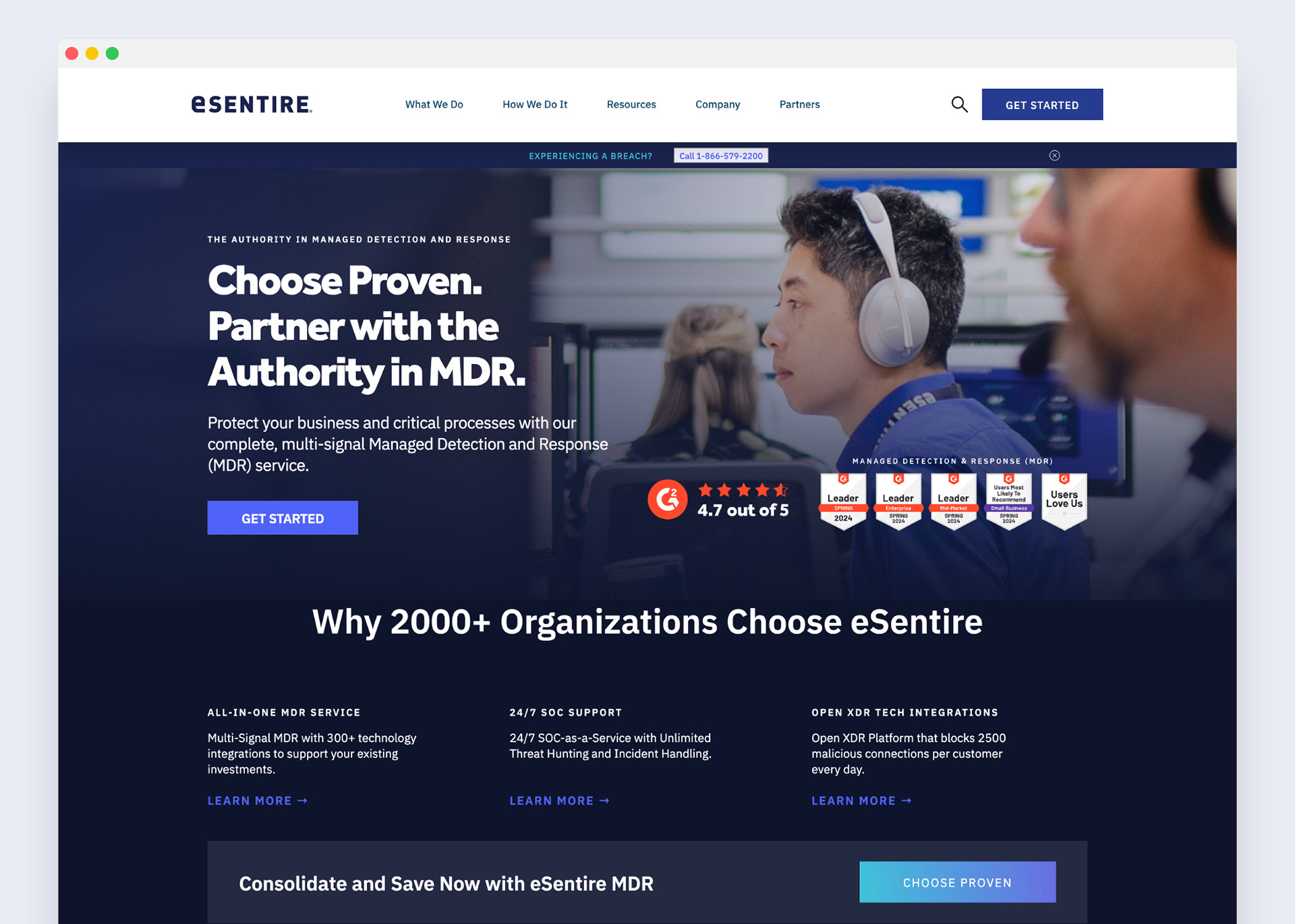
The strategic overhaul delivered immediate ROI. By transforming the site from a digital brochure into a scalable conversion engine, the new architecture achieved:
The strategic overhaul delivered immediate ROI. By transforming the site from a digital brochure into a scalable conversion engine, the new architecture achieved:
$8.9 Million Pipeline Contribution
Served as the primary destination and conversion anchor for inbound campaigns, generating massive marketing-sourced revenue.
17% to 25% Conversion Lift
Concentrated specifically within the newly optimized intake flows and restructured navigation menus.
95% Website Health Score
Reached the highest technical and usability score in the company’s history.
Future-Proof Scalability
he modular design system shipped on schedule and easily adapted to the subsequent 2025 Assured Intelligence product repositioning without requiring structural teardowns.
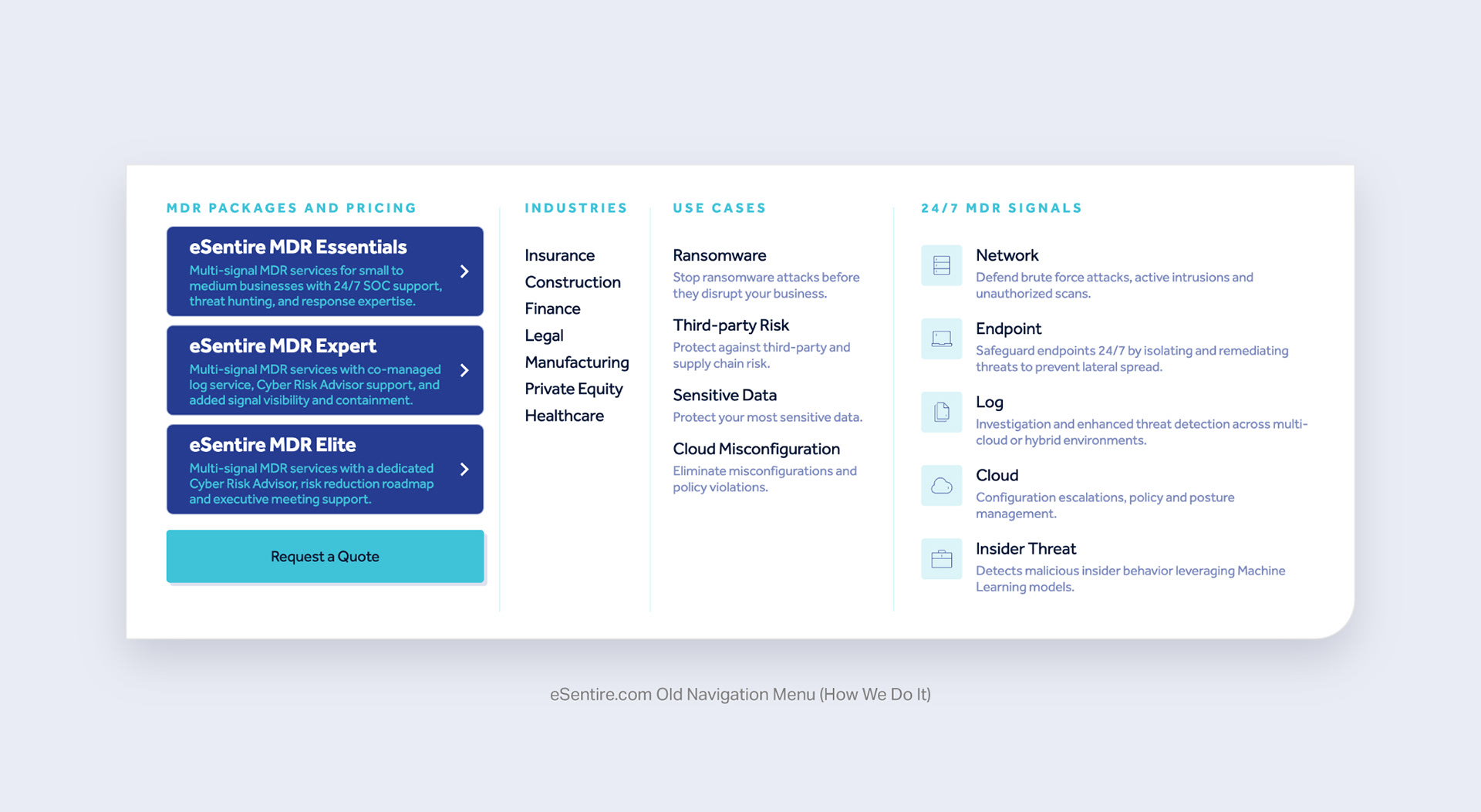
The navigation rework is one clear example of the underlying pattern, not the whole story, so here's how that same shift played out across the rest of the site.
The old version split package pricing, industries, use cases, and 24/7 signal coverage across four separate columns. Industries were limited to 7 verticals, use cases to 4, each with a longer descriptive line, and the package tier cards were solid, dark blocks that competed visually with everything around them. A single generic Request a Quote button was the only path forward.
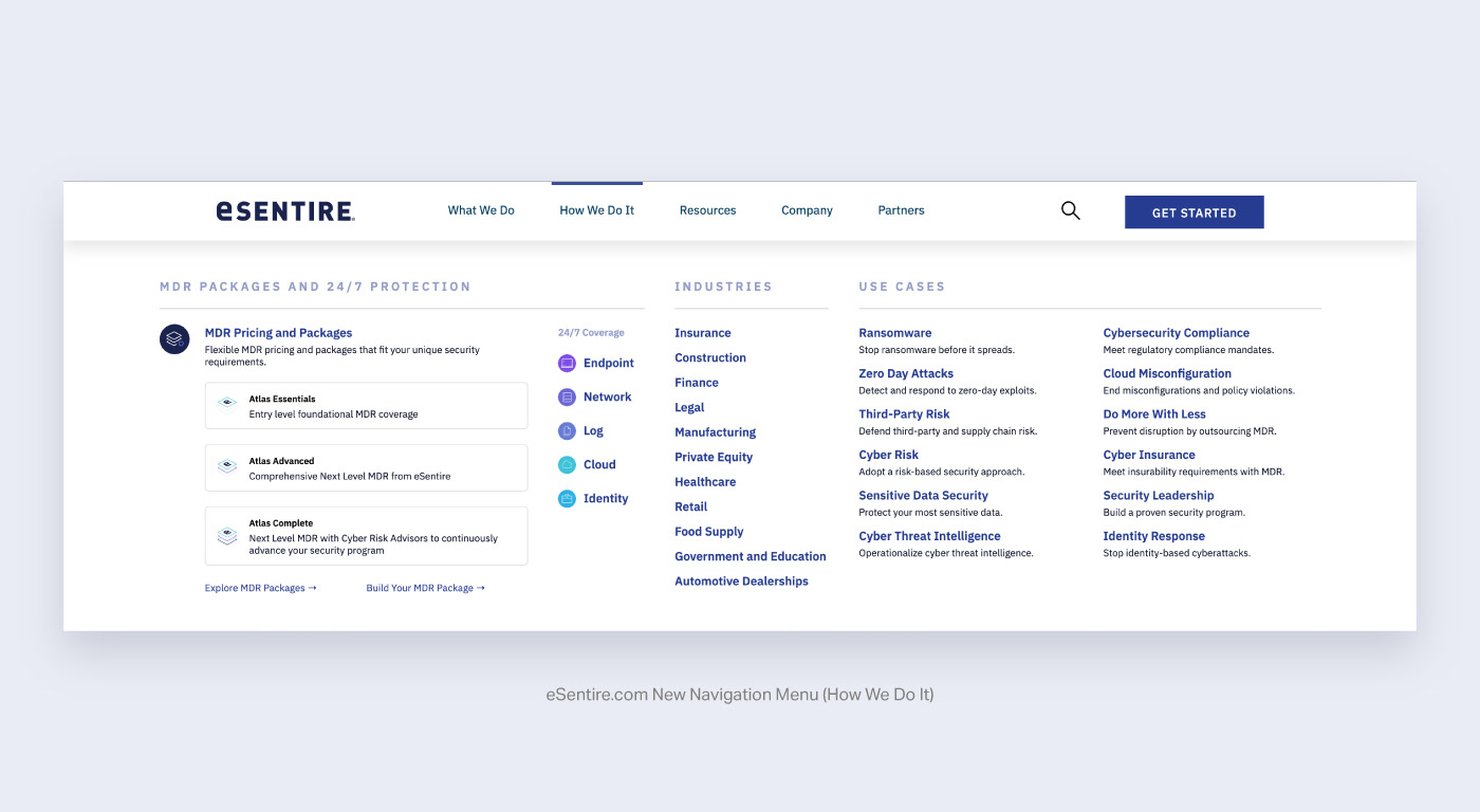
The new version covers more ground in less space. Industries expanded to 11 verticals and use cases to 12, each trimmed to a single scannable line, with 24/7 signal coverage folded into the industries column instead of running as its own. That freed up a full column to let use cases breathe.
The package cards lightened to match the site's cleaner visual language, and the single CTA split into two: Explore MDR Packages for visitors who want to browse, and Build Your MDR Package for visitors ready to configure one. Broader coverage, tighter copy, and two paths to conversion instead of one: this menu sits behind one of the highest-traffic items in the primary nav, and it's a direct contributor to the 17 to 25 percent conversion lift.
The package cards lightened to match the site's cleaner visual language, and the single CTA split into two: Explore MDR Packages for visitors who want to browse, and Build Your MDR Package for visitors ready to configure one. Broader coverage, tighter copy, and two paths to conversion instead of one: this menu sits behind one of the highest-traffic items in the primary nav, and it's a direct contributor to the 17 to 25 percent conversion lift.