A consulting firm that outgrew its own name.
A rebrand built to match the business it was becoming.
A rebrand built to match the business it was becoming.
Overview
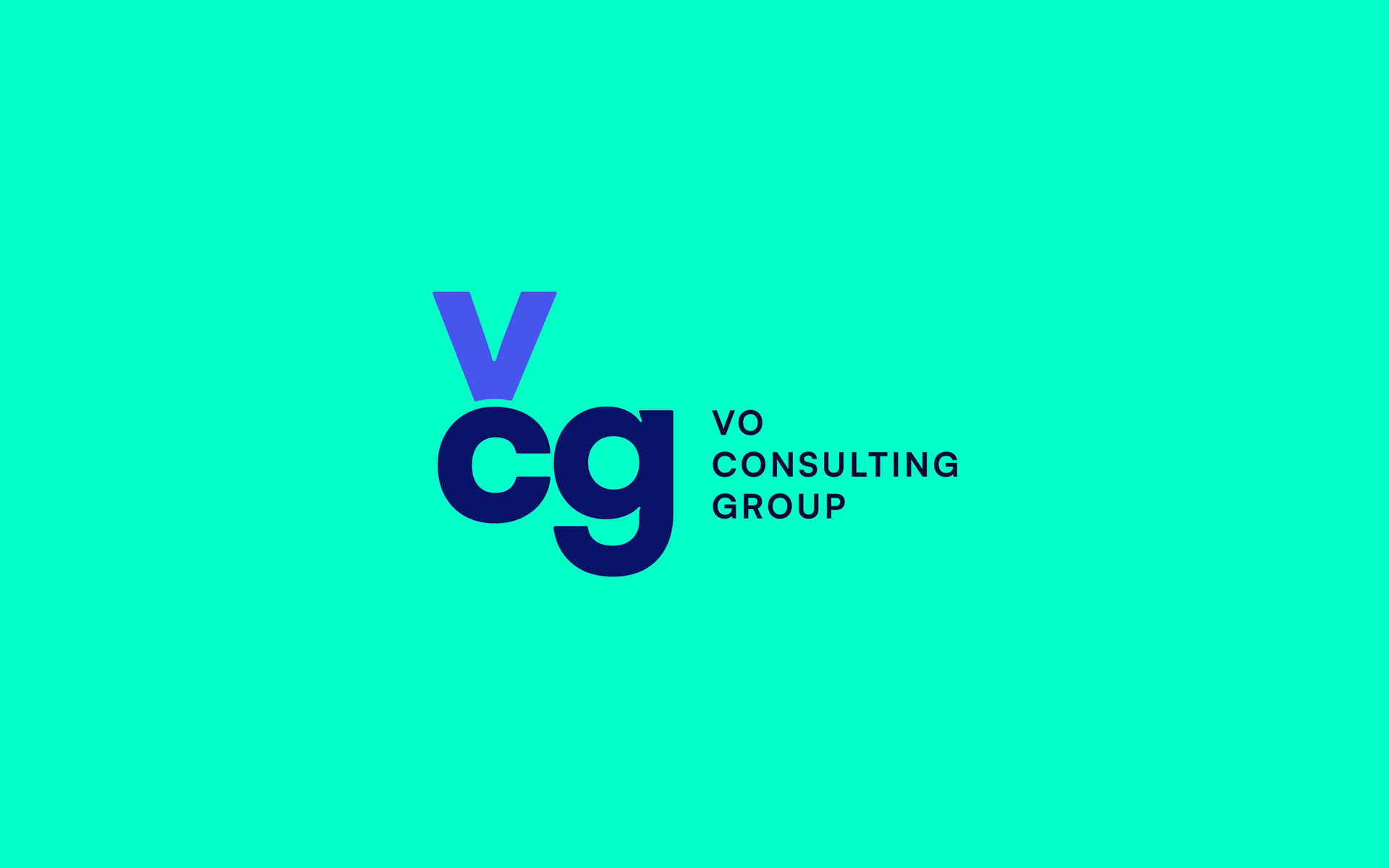
Vo Consulting had built a strong reputation in Oracle NetSuite implementation. But as the practice grew, the name and identity started to feel like a constraint. The CEO made a deliberate decision: evolve the business, and build a brand worthy of where it was headed. Vo Consulting became VCG, and the new identity needed to reflect that ambition honestly.
Vo Consulting had built a strong reputation in Oracle NetSuite implementation. But as the practice grew, the name and identity started to feel like a constraint. The CEO made a deliberate decision: evolve the business, and build a brand worthy of where it was headed. Vo Consulting became VCG, and the new identity needed to reflect that ambition honestly.
My Role
I led the full engagement as a solo brand designer, working directly with the CEO from discovery through final delivery.
I led the full engagement as a solo brand designer, working directly with the CEO from discovery through final delivery.
The Outcome
VCG rolled out the new brand across their client-facing materials and business development presence. In the time that followed, they landed larger enterprise clients, the kind of mandates the identity was built to support. The rebrand did what it was supposed to do.
VCG rolled out the new brand across their client-facing materials and business development presence. In the time that followed, they landed larger enterprise clients, the kind of mandates the identity was built to support. The rebrand did what it was supposed to do.
The Challenge
VCG didn't need a brand strategy workshop. The CEO came in with clarity about who they were, who they were selling to, and what they wanted to become. The real challenge was translating that clarity into a visual identity that could hold its own in front of enterprise clients and signal that something meaningful had changed.
VCG didn't need a brand strategy workshop. The CEO came in with clarity about who they were, who they were selling to, and what they wanted to become. The real challenge was translating that clarity into a visual identity that could hold its own in front of enterprise clients and signal that something meaningful had changed.
The Process
I began with a discovery conversation to understand the business context behind the rebrand. We talked about target clients, competitive positioning, and the perception VCG wanted to own in the market. From there, I reviewed the competitive landscape to identify how other ERP consulting firms were showing up visually, and where VCG had room to differentiate.
With that foundation in place, I developed mood boards to align on a visual direction before any logo work began. This kept the process focused and ensured every creative decision was connected to something real.
I began with a discovery conversation to understand the business context behind the rebrand. We talked about target clients, competitive positioning, and the perception VCG wanted to own in the market. From there, I reviewed the competitive landscape to identify how other ERP consulting firms were showing up visually, and where VCG had room to differentiate.
With that foundation in place, I developed mood boards to align on a visual direction before any logo work began. This kept the process focused and ensured every creative decision was connected to something real.

The Logo
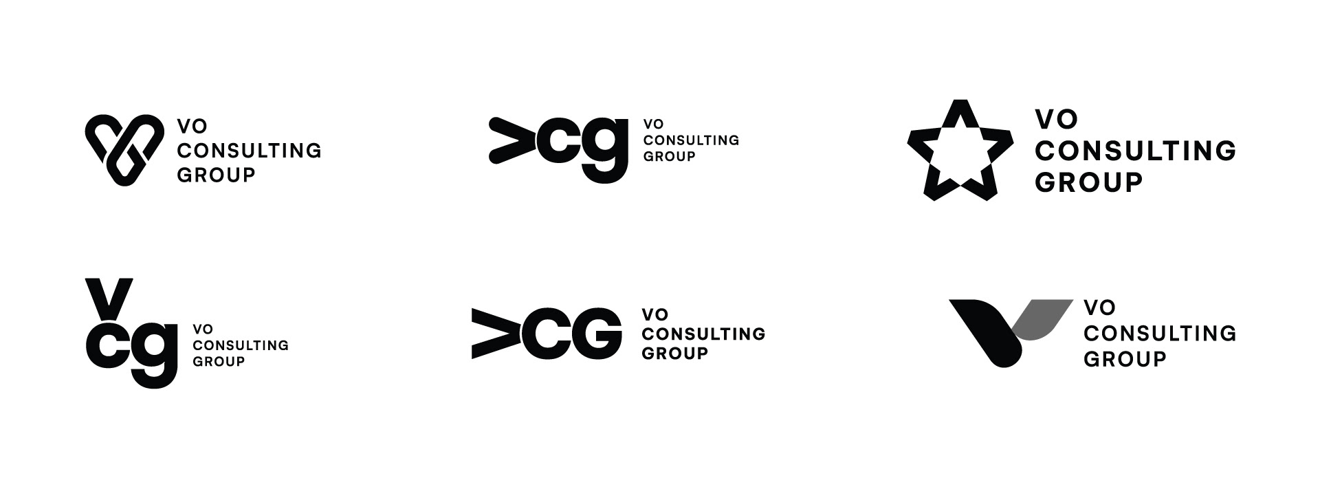
The CEO's direction was straightforward: the mark needed to be distinctive and immediately readable as VCG. I presented a range of concepts, from a stylized V with interlocking C and G letterforms to a clean stacked monogram. When the CEO shared the options with his team, the stacked configuration was a quick consensus. Its legibility and confidence made it the right fit for a firm stepping into larger rooms.
The CEO's direction was straightforward: the mark needed to be distinctive and immediately readable as VCG. I presented a range of concepts, from a stylized V with interlocking C and G letterforms to a clean stacked monogram. When the CEO shared the options with his team, the stacked configuration was a quick consensus. Its legibility and confidence made it the right fit for a firm stepping into larger rooms.
Visual Identity
Colour Palette
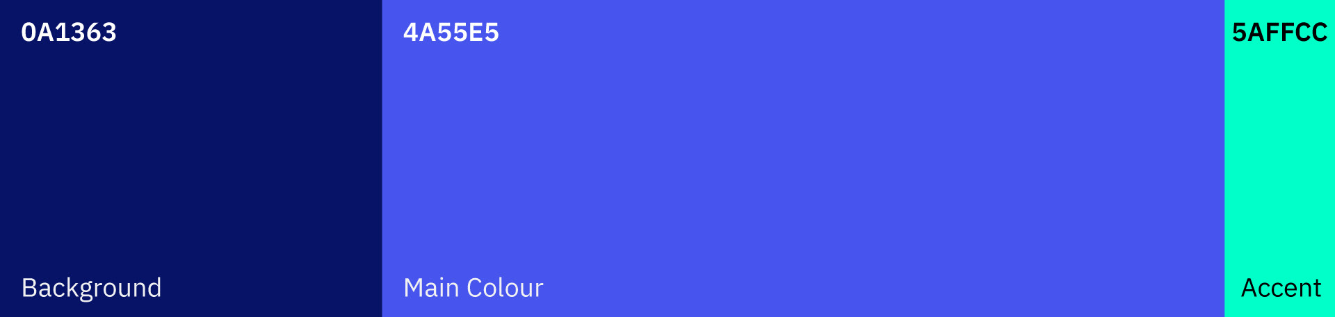
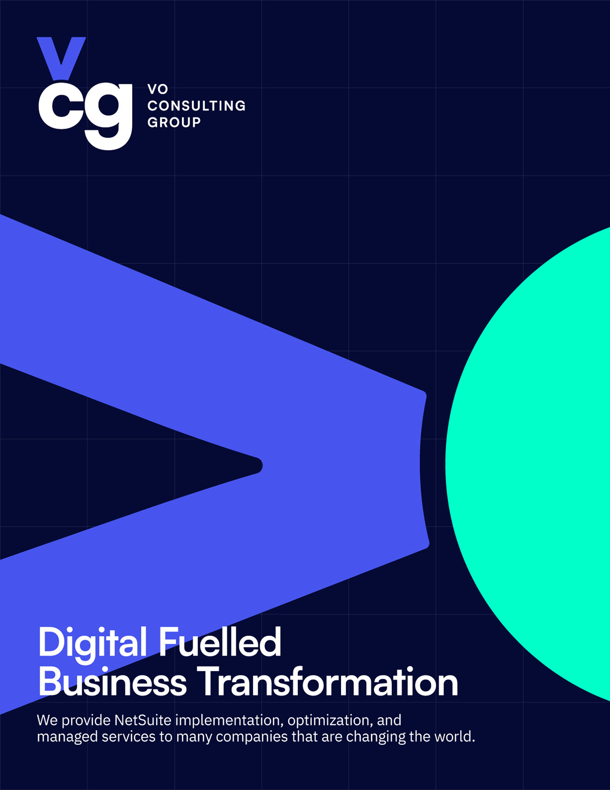
For a tech consulting firm competing against more established players, colour was an opportunity to stand apart. We landed on a palette of dark navy, light indigo, and bright seafoam green. Navy provided the authority. Indigo added depth and modernity. The seafoam accent brought energy without tipping into noise. Together, the palette feels fresh and credible in equal measure.
For a tech consulting firm competing against more established players, colour was an opportunity to stand apart. We landed on a palette of dark navy, light indigo, and bright seafoam green. Navy provided the authority. Indigo added depth and modernity. The seafoam accent brought energy without tipping into noise. Together, the palette feels fresh and credible in equal measure.

Visual Language
VCG wanted to feel different from the typical consultancy, which often defaults to something rigid and corporate. To balance the boldness of the colour system, I paired it with muted, black and white photography. The contrast gives the brand room to breathe. Every element has a clear role, and nothing competes for attention.
VCG wanted to feel different from the typical consultancy, which often defaults to something rigid and corporate. To balance the boldness of the colour system, I paired it with muted, black and white photography. The contrast gives the brand room to breathe. Every element has a clear role, and nothing competes for attention.